 "
"
Team:Oxford/biosensor characterisation
From 2014.igem.org
(Difference between revisions)
Olivervince (Talk | contribs) |
Olivervince (Talk | contribs) |
||
| Line 450: | Line 450: | ||
<img src="https://static.igem.org/mediawiki/2014/f/f1/Oxford_data1.png" style="float:right;position:relative; width:50%;" /> | <img src="https://static.igem.org/mediawiki/2014/f/f1/Oxford_data1.png" style="float:right;position:relative; width:50%;" /> | ||
| - | <h1> | + | <h1>Introduction</h1> |
As you can see from the biochemistry bubble above, our team was only able to obtain fluorescence data for the first half of the genetic circuit (ATC induced mCherry response). On top of this, the wet lab team were unable to obtain data that measured how the fluorescence of a single culture changed with time, again because of time constraints. This is slightly limiting because it means that we don’t have any dynamic data for any part of our system, and therefore can’t test the modelling predictions of the speed of the biosensor’s response. | As you can see from the biochemistry bubble above, our team was only able to obtain fluorescence data for the first half of the genetic circuit (ATC induced mCherry response). On top of this, the wet lab team were unable to obtain data that measured how the fluorescence of a single culture changed with time, again because of time constraints. This is slightly limiting because it means that we don’t have any dynamic data for any part of our system, and therefore can’t test the modelling predictions of the speed of the biosensor’s response. | ||
<br><br> | <br><br> | ||
| Line 456: | Line 456: | ||
<br><br> | <br><br> | ||
Standard error is calculated as the average standard deviation divided by the square root of the total number of readings. | Standard error is calculated as the average standard deviation divided by the square root of the total number of readings. | ||
| + | |||
| + | |||
| + | <h1>How we used the model</h1> | ||
| + | However, to demonstrate the power of the computer models that we’ve built, we made our model simulate the same graph (mean fluorescence against ATC concentration added). To build this, we started from the graph shown in the <u>first modelling bubble</u> on this page, shown here with a small basal rate (see <u>where did these equations come from?</u>). This graph shows how the predicted fluorescence of the cells changes with time in response to an addition of ATC halfway along the time scale. At this stage, all input values, model parameters and therefore results are arbitrary. | ||
Revision as of 21:09, 12 October 2014


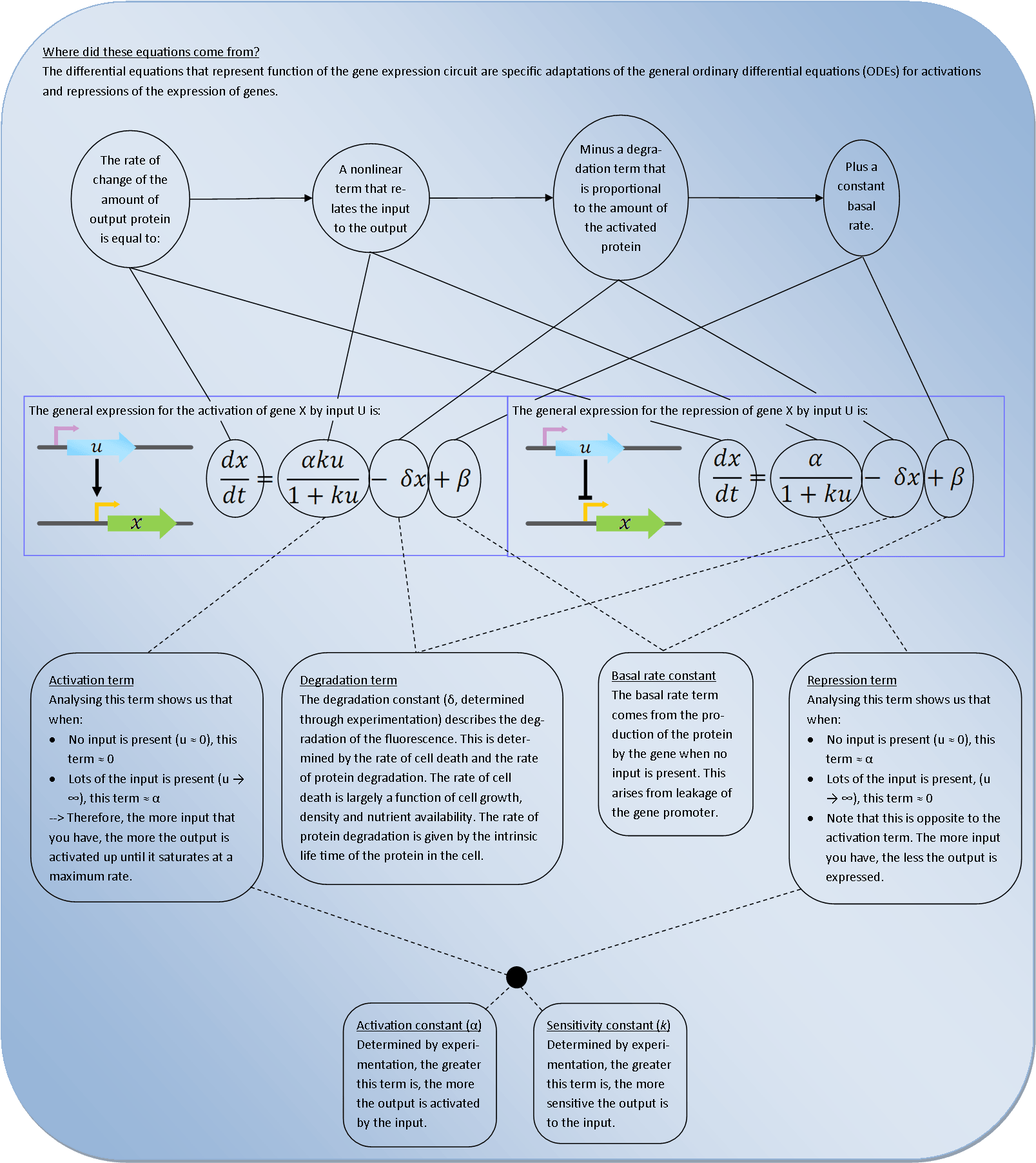
 Deterministic models are very powerful tools for synthetic biology. They describe the behaviour of the bacteria at the population level and use Ordinary Differential Equations (ODEs) to relate each activation and repression. By constructing a cascade of differential equations one can build a realistic model of the average behaviour of the system.


 Oxford iGEM 2014