 "
"
Team:ETH Zurich/expresults
From 2014.igem.org
| Line 2: | Line 2: | ||
<html> <style> | <html> <style> | ||
@media only screen and (max-width: 767px), (max-device-width: 1024px) and (min-device-width: 768px) | @media only screen and (max-width: 767px), (max-device-width: 1024px) and (min-device-width: 768px) | ||
| - | table, thead, tbody, th, td, tr {display:compact;} | + | table, thead, tbody, th, td, tr {display:compact!important;} |
</style> </html> | </style> </html> | ||
Revision as of 10:04, 17 October 2014

Experimental Results
Riboregulators
High basal expression from inactive inducible promoter (leakiness) is a common challenge in the implementation of robust biological control system. The problem is especially severe for systems that approximate digital Boolean logic or drive an amplified downstream response. In the first case an OFF state can be interpreted as ON resulting in incorrect computations. The second scenario leads to high levels of undesired final response. Many former iGEM teams have encountered unwanted basal expression of their genes of interest (goi) due to promoter leakiness (ETH2013, Groningen2012, amongst others), resulting often in narrow optimal operation conditions for their biological devices. Since our system is based on Boolean Logic for its decisions and relies on downstream amplification to regenerate and propagate the signal as a first step we investigated strategies to improve tight gene control. Looking into the available literature we found riboregulators as a promising, highly generalizable approach to address the issue of leakiness[32]. As a convenient proof of concept we coupled the system with quorum sensing modules characterized the response and made the resulting parts available for the iGEM community in the Registry of Standard Biological Parts. We suggest that this approach can be generalized to improve many of the inducible system contained in the registry
The riboregulator systems include two parts: 1) a cis-repressed RBS in front of the goi, and 2) a co-expressed trans-activating RNA.
To characterize this system for reliable cell-to-cell communication, we combined the riboregulator part with promoters of the quorum-input-sensing systems used by our team (LuxI/LuxR, LasI/LasR, and RhlI/RhlR). In our final gene circuit, the riboregulators were intended for tight control of integrases. However, to have an easily quantifiable and proportional output, we initially used GFP as our riboregulated goi and measured the output fluorescence with a Tecan plate reader. This approach is described below in the figure 1.

The first set of experiments was conducted with cells transformed with two different pPaB plasmids. These plasmids contained either the pBR322 origin (pMB1) or the p15A origin, yielding a stable two-plasmid system with about 15-20 copies per plasmid and cell (medium-copy). Furthermore the published riboregulator sequence includes two forbidden restriction sites (EcoRI and XbaI), since the sites removal could affect the folding or functionality of the part, the original sequences were used as a control. After characterizing the original part the restriction sites were removed by two different approaches: a) multiple site-directed mutagenesis, b) blunting and ligation (Klenow and T4 DNA polymerase). The new Biobrick compatible riboregulator was tested to confirm that no severe loss-of-function occurred due to the site-removal. In a third step, the construct was transferred into the pSB1C3 backbone (pMB1 origin, high copy number of 100-300) to be in line with the BioBrick Standard. Below, you can find the corresponding graphs in figure 2 and figure3, respectively. Future characterization of these constructs should allow us to explore the leakiness dependence on plasmid amount and if the tight expression is robust for different copy numbers.
We have characterized promoters response of the three quorum-sensing systems. These are pLux, pLas, and pRhl. We first measured the transfer functions with a non-regulated RBS in front of sfGFP, i. e. the amount of fluorescence in dependence of the inducer concentration present and compared the response with the corresponding riboregulated constructs with and without the forbidden restriction sites. All experiments were carried out in 96-well microtiter plate format for 10 h. This kinetic data-sets were also used for parameter-fitting in our modeling approach.
We found an about 60-fold reduced basal GFP expression and an increased signal-to-noise ratio of about 6-fold when using our riboregulator construct, as compared to a non-regulated reference RBS (B0034). These results are summarized in figure 2. The BioBrick conform module was confirmed to show no loss-of-funtion due to EcoRI and XbaI site removal. Interestingly the sensitivity towards the inducer was reduced (see figure 3). Is interesting to speculate if small changes in the sequences flanking the riboregulator could be used as a way to switch the response curve.
 |  |
| Figure 3 Improved signal-to-noise ratio and decreased basal GFP expression (leakiness) due to the use of a riboregulator in combination with a quorum-sensing module. The fluorescence per OD600 is shown for the LuxR-system with a complete riboregulator over an inducer-range of 10-13 M to 10-5 M (dashed, light blue). An incomplete riboregulator without the trans-activator shows the expected reduced sensitivity towards the inducer (dark blue). As a reference, a system with a non-regulated RBS (BBa_B0034) is shown (light blue). Data points are mean values of triplicate measurements in 96-well microtiter plates 200 min after induction ± standard deviation. For the full data set and kinetics please contact us or visit the raw data page. | Figure 4 Confirmation of the improved signal-to-noise ratio and decreased basal GFP expression (leakiness) due to the use of a riboregulator without (w/o) EcoRI and XbaI restriction sites in combination with a quorum-sensing module. The fluorescence per OD600 is shown for the LuxR-system with an unchanged riboregulator (dashed, light blue) and a regulator with a changed sequence due to EcoRI and XbaI restriction site removal (dashed, dark blue). The inducer range covers 10-13 M to 10-5 M. As a reference, a system with a non-regulated RBS (BBa_B0034) is shown (light blue). Data points are mean values of triplicate measurements in 96-well microtiter plates 200 min after induction ± standard deviation. For the full data set and kinetics please contact us or visit the raw data page. |
Quorum Sensing
For our Mosiacoli project, we were looking for molecular systems that allow orthogonal cell-to-cell communication in order to implement connected XOR logic gates. We decided to exploit the quorum sensing systems LuxI/LuxR, LasI/LasR, and RhlI/RhlR in order to achieve the required orthogonal cell-to-cell communication. We developed a model for these cellular information processing. Even though the corresponding inducer molecules are commercially available and the systems often used, in particular in iGEM projects (e.g. pLux (BBa_R0062), 'Top 10 Most used promoters' with 246 uses), potential crosstalk activity between the different systems may be a severe problem (e. g. Tokyo_Tech 2013, Peking University 2011).
In order to address this challenge, we measured a) a given promoter with its corresponding regulator and a different inducer molecule, b) a given promoter with an unspecific regulator and a particular inducer, c) a given promoter with both regulator and inducer being unspecific, and always included the correct combination of inducer molecule, regulator and promoter as a positive control. This gives in total 27 possible combinations. The output was assessed via sfGFP and measured in terms of fluorescence on microtiter-plate scale.

Summary of experimental results regarding quorum sensing
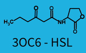
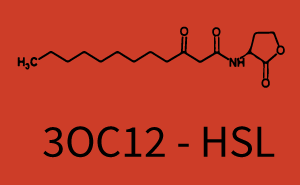
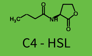
The following matrices serve as an overview summarizing the most significant results of our experiments to characterize crosstalk on different levels. On the horizontal top row we see the three different inducer molecules (3OC12-HSL, 3OC6-HSL, C4-HSL). In the top left corner we see the quorum sensing promoter used for all the experiments summarized in this matrix. On the vertical axis we see the three regulators ( LuxR, LasR, RhlR). These matrices are giving an overview of the experimental results conducted in relation with quorum sensing and crosstalk. The graph shown in each matrix on the very top left describes the situation where the correct autoinducer molecule has bound the corresponding regulator and this complex has then induced the correct promoter. The solid lines in the graphs show the model data, whereas the data points indicated with standard deviation show experimental data in triplicates (mean values of triplicate micro titerplate measurements).
|
In all the measurements conducted to create this matrix the promoter pLux was the basis and was induced in six different variations shown. The dark blue points in the graph top left show the activation of gene expression when pLux is induced by 3OC6-HSL (Lux-AHL) binding to the corresponding LuxR regulator. The observed transition occurs at a concentration of approximately 1 nM of 3OC6-HSL. The light-blue curve plotted shows modeling data of pLux induced by 3OC6-HSL (Lux-AHL) binding to the corresponding LuxR regulator. This curve from the model and the dark blue data points obtained from experiments were plotted as a reference in all the other graphs describing pLux. Crosstalk can be observed for the cases where the 3OC12-HSL (Las-AHL) binds the LuxR regulator. Additionally for 3OC12-HSL binding to its corresponding regulator LasR and then binding to the pLux as seen in the middle of the top row and center of the matrix. For the case of Las-AHL binding the regulator LasR and subsequently the promoter pLux, the transition occurs at 1 nM and reaches 0.5 fold the fluorescence as pLux induced by 3OC6-HSL binding LuxR. In the case of 3OC12-HSL binding LuxR and inducing the promoter pLux, the transition is observed at approximately 100 nM and severe crosstalk is observed, meaning that the ON-OFF-ratio is not significantly different from the reference curve. Observation of C4-HSL has shown, that there is no significant crosstalk with the LuxR regulator and LasR regulator binding C4-HSL and subsequently to pLux. This is indicated on top right and middle right graphs. However, RhlR induced with its corresponding inducer (C4-HSL) binds to pLux and activates expression of GFP at about 100 nM. | |||
| 
| 
| 
|

| 
| 
| 
|

| 
| 
| 
|

| 
| 
| 
|
|
The promoter of interest in this matrix is pLas. The graph on top left corner shows the induction of pLas by its corresponding inducer (3OC12-HSL) binding the corresponding LasR. The red line shows the model whereas the datapoints shown in red represent the experimental results. The transition can be observed at a concentration of Las-AHL of about 2 nM. 3OC6-HSL binding RhlR does not induce the pLas. For the binding of 3OC12-HSL to RhlR a minor increase of fluorescence can be observed. The same can be observed for 3OC12-HSL binding to the LuxR as this combination is to a small degree inducing pLas. The most significant case of crosstalk when observing pLas is shown in the graph in the center of the matrix. It is clearly shown that 3OC6-HSL (Lux-AHL) binding to the corresponding LuxR regulator is able to induce pLas, resulting in fluorescence values of about 250 a.u.. This is the most severe case of crosstalk observed as the induction of pLas by the corresponding inducer and regulator molecule is not significantly different measured by fluorescence as induction by Lux-AHL binding the LuxR and subsequently pLas. For C4-HSL binding the three regulators LasR, LuxR and RhlR and then the pLas no crosstalk can be observed. | |||
|
|
|
|
|
| 
| 
| 
|
|
| 
| 
| 
|
|
| 
| 
| 
|
|
In this set of experiments the promoter pRhl was tested for potential crosstalk. In the top left position we observe the induction of pRhl by C4-HSL bound to the regulator RhlR. The switching behaviour was observed at a C4-HSL concentration of 1 μM. In the case of 3OC12-HSL binding the RhlR regulator and subsequently the promoter pRhlinsignificant crosstalk has been observed. Severe crosstalk was observed in the case of 3OC6-HSL binding the RhlR regulator followed by induction of pRhl. The transition occurred at a concentration of the inducer molecule of 1 μM but compared to the reference curve a lower value of fluorescence per OD was observed (1000 a.u.). Another case of crosstalk with the pRhl was detected with 3OC12-HSL binding to the corresponding LasR regulator followed by inducing the promoter pRhl. Here switching occurred at a concentration 1 nM of 3OC12-HSL and reached fluorescence per OD of 750 a.u.. This is approximately 0.5 fold the value of the fluorescence per OD shown by the reference curve indicated in green. | |||
|
|
|
|
|
| 
| 
| 
|
|
| 
| 
| 
|
|
| 
| 
| 
|
Conclusion of crosstalk experiments
As shown in the graphs in the matrices above, we found and quantitatively characterized all three levels of crosstalk. The three levels were the following:
- A given promoter with its corresponding regulator and a different inducer molecule
- A given promoter with an unspecific regulator and a particular inducer
- A given promoter with both regulator and inducer being unspecific
Unspecific inducers binding to the regulators as well as unspecific binding of the regulator to another promoter species was observed in almost all possible combinations. To conclude, we were not able to find an orthogonal quorum sensing pair out of the three systems investigated (LuxI/LuxR, LasI/LasR, or RhlI/RhlR). While we see a significant effect when implementing the influence of these crosstalks (on an inducer-, regulator- and promoter-level) in our whole cell model, the logic gate still continues to function for a range of inputs at physiological concentrations.
Integrases
The design of our XOR gates was based on integrase logic[9]. This means, depending on the input molecules, integrases can be expressed, subsequently switch a terminator sequence previously blocking gene expression, and then the output gene can be transcribed. This approach is explained here.
In order to characterize the integrase system described above, we first combined the pLux promoter (BBa_R0062) with one of our integrase genes bxb1, followed directly by a red fluorescent protein (RFP, mCherry) to make the expression accessible. Also, this system includes an XOR buffer gate per default blocking transcription of sfGFP. Upon BXB1 activity and switching the gate into ON-state, the terminator should have been removed and sfGFP should have been expressed. We intially designed three different constructs for characterization of the recombinases and their cross-activity. However, the measurement of fluorescent proteins, with both a plate reader and a flow cytometer, did not indicate sfGFP expression due to recombinase activity. Nevertheless, RFP was clearly detectable upon induction in plate reader experiments suggesting that the induction itself worked (see figure 5 and 6).
 |  |
As our constructs did not show the expected functionality, we decided to directly use the plasmids described by Bonnet et al.[9] which where obtained from addgene (Dual-recombinase-controller, XOR gate-V2.0). The data available from the original experiment by Bonnet[9] was used in our model to retrieve the missing parameters of integrases. However, we were using a TOP10 strain not expressing TetR by default (as compared to DH5alphaZ1) and as a result our strain had to be co-transformed with an additional plasmid encoding TetR. Also, we used defined M9 medium with 0.4% glycerol and 1% CAA instead of proprietary defined medium (Teknova Hi-Def Azure medium). As of today, this set-up did not allow us to get the integrase XOR gate running. The fluorescence readout for ON-states (exactly one input, either 0.1% L-arabinose or 200 ng/mL anhydrous tetracycline) and the OFF-states was not as expected (see figure 7). The OFF-state should not show increased fluorescence over time, while the ON-states should increase significantly after 4 h and continue to increase over the whole time span[9]. We are not giving up on this and are proceeding with debugging our construct further and hope to find a solution until the Giant Jamboree in Boston.

Diffusion On Chip
Our project aims for the biological implementation of cellular automata with XOR logic gates. In order to achieve this, we found a way to create a regular grid of cells with a defined, optimal neighborhood. This means channel length, well size, and medium were optimized and the properties were modelled with Matlab and Comsol whenever feasible. With these in silico results in mind we used CAD software to design our custom made molds, which where then 3D-printed and used for the production of PDMS chips. The cells containing one of our genetic circuits were encapsulated in alginate beads and loaded on the millifluidic chip arranged in a Sierpinski triangle. All other wells were filled with beads containing cells not able to produce GFP as a background reference. This approach allowed us to establish a method for measuring diffusion and cell-to-cell communication. In particular, a step towards the emergence of complex patterns by cell-to-cell communication was made. Also the Comsol model regarding pattern formation was confirmed experimentally with our rapid-prototyping approach. The final time-lapse video of the cell-to-cell communication experiment is shown below in video 1.
|
| |
| Video 1 Row wise, self-propagating cell-to-cell communication of E. coli cells confined in alginate beads (d=3 mm, initially 107 cells/bead) on a custom-made millifluidic PDMS chip. | |
| All cells contained riboregulated sfGFP followed by LuxI (BBa_C0161) together under the control of the pLux promoter (BBa_R0062), and constitutively (BBa_J23100) expressed LuxR (BBa_C0062). LuxI catalyzes the production of the autoinducer 3OC6-HSL, which is then diffusing from cell to cell. For initialization, the cells in one bead of the top row were induced with 3OC6-HSL before encapsulation. Imaging was implemented with a Biostep Dark-Hood DH-50 (Argus X1 software) fitted with a Canon EOS 500D DSLR camera and a fluorescence filter (545 nm filter). Pictures were usually taken every 2 min at an excitation wavelength of 470 nm with the standard Canon EOS Utility software. Time-lapse movies were created with Adobe After Effects CC software. 1950x faster than real-time, the video shown starts 10 h after the initiation of the experiment (however the time scale shown corresponds to minutes after loading of the chip) | Simulation of the propagation of the pattern in the millifluidic chip. Comsol Multiphysics Simulation software was used in order to simulate a detailed diffusion model including quorum sensing steps in colonies and cell growth. Overall GFP concentration in beads has been scaled in order to account for the high background of the experimental setup. Green Fluorescence Protein is produced earlier in the wells, but can be seen only above a certain threshold. Accurate prediction of experimental data by the model has been achieved, with parameters from our own fittings or from the literature. Experimental observation combined with simulation enables to show that a pattern is able to develop in the millifluidic chip in a reasonable time scale. For precise equations and other dynamic results, check the Diffusion model page. |